Goodreads
redesigning a social platform to help readers enhance their book tracking, discovery, and categorizing experience

Goodreads is a social cataloging website that serves over 125 million users worldwide. It helps readers find books, read reviews, and create shelves to track their reading history.

Goodreads has an outdated design that makes these functions harder for its massive user base.
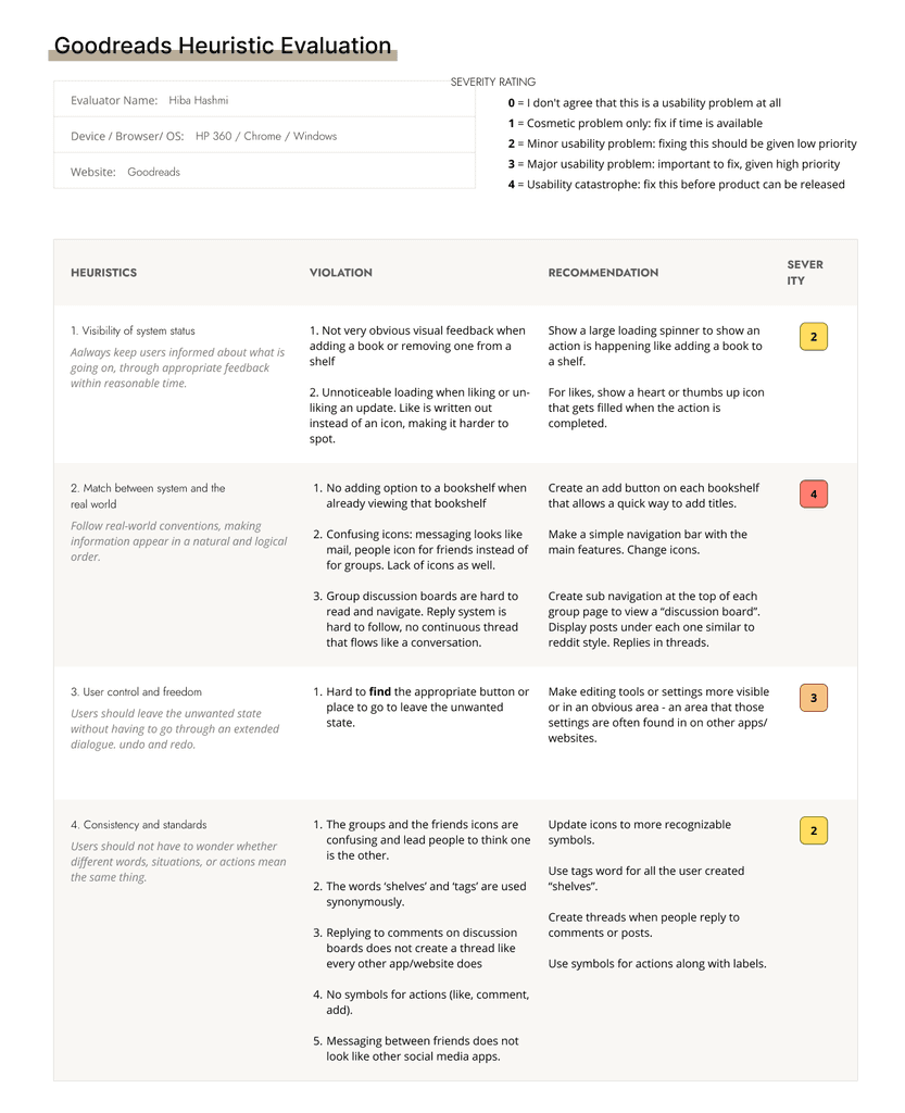
A heuristic evaluation helped determine which areas of Goodreads proved to be the biggest problems in the system:
1) No match between system and real world
2) Overwhelming design
3) Poor help and documentation

8 surveyors were asked to identify how they preferred to use Goodreads. They were prompted to rate the most important features to them.
I interviewed 5 different people to discover what Goodreads users are currently struggling with when they interact with the mobile and web versions of the application. I asked them questions to understand what their day to day usage of Goodreads entails.
These personas are different in the way they choose to interact with other users on the Goodreads platform. Bessie is an observer of reviews while Vanessa actively contributes to leaving book reviews.


I created a journey map for my persona Bessie to discover which areas of opportunity to focus on to improve the Goodreads user experience significantly.
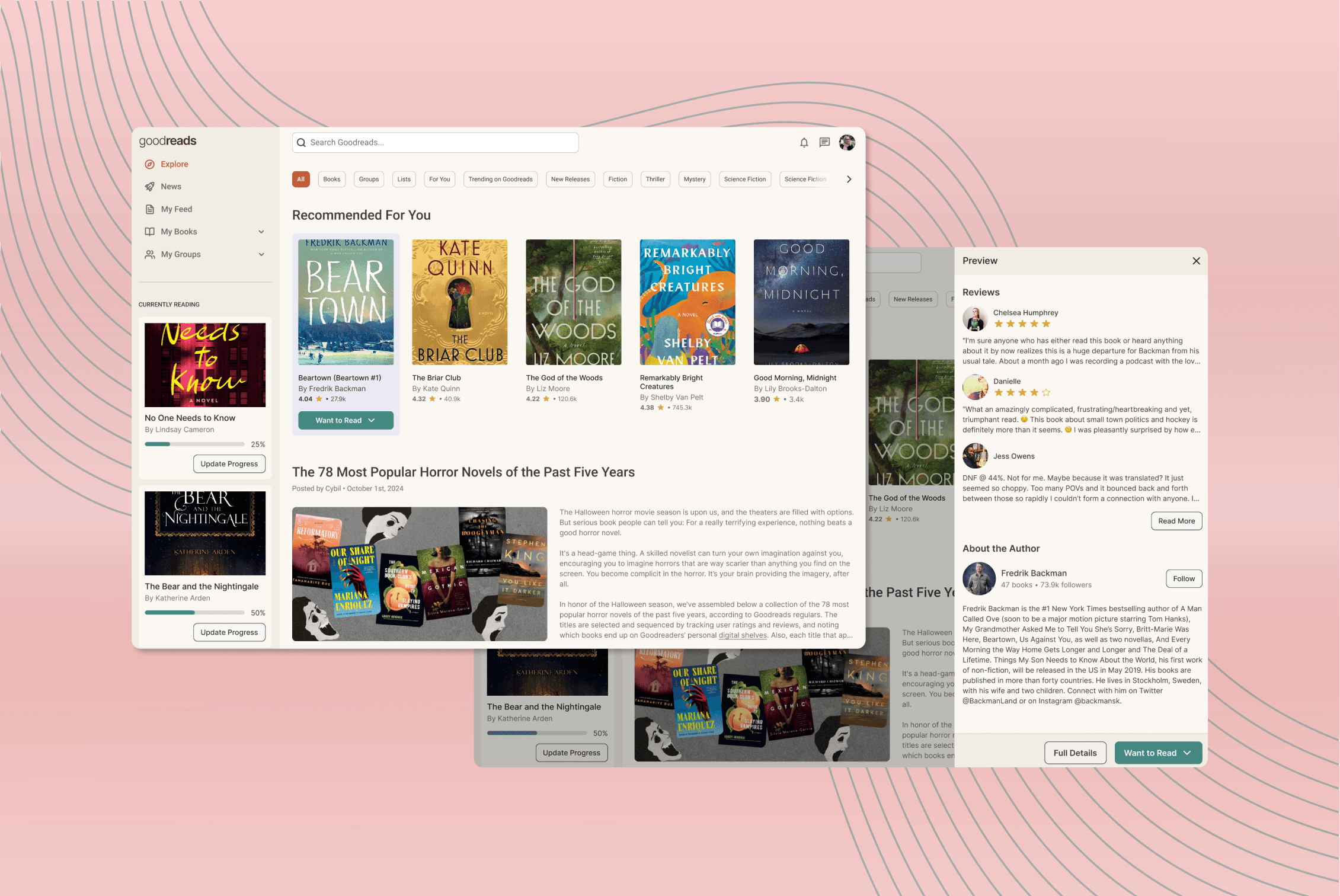
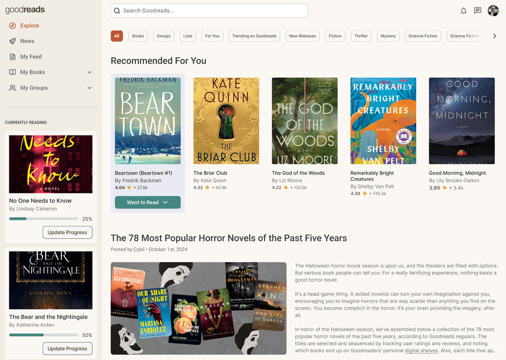
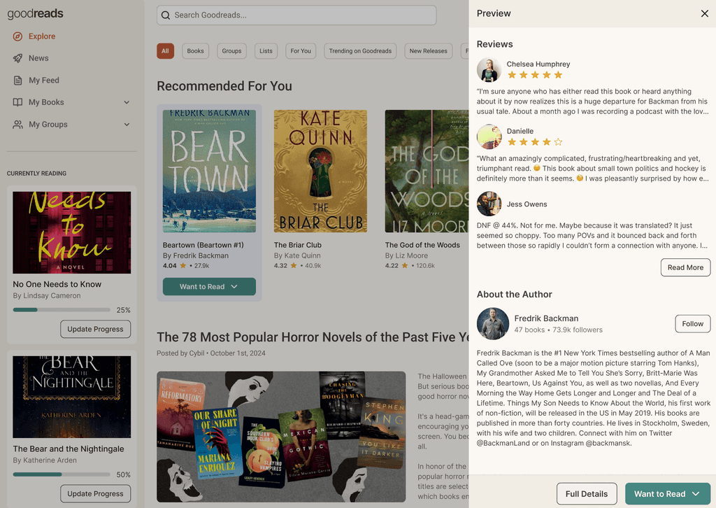
These were the initial designs I created, focused on solving for information hierarchy and easy navigation of a user's books. However, these designs did not use an existing design system so they lack some visual consistency.


After working for a year, I sharpened my UI and visual design skills. These updated screens use the Unititled UI Library.